صفحة «ملاحظاتكم» لاستقبال اقتراحاتكم لتطوير الموقع، والإبلاغ عن الأعطال والمشاكل، وتقديم الشكاوى.
logo
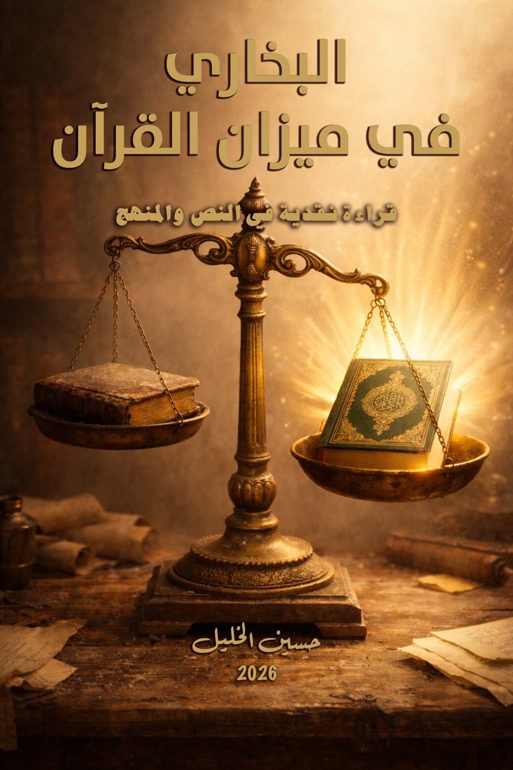
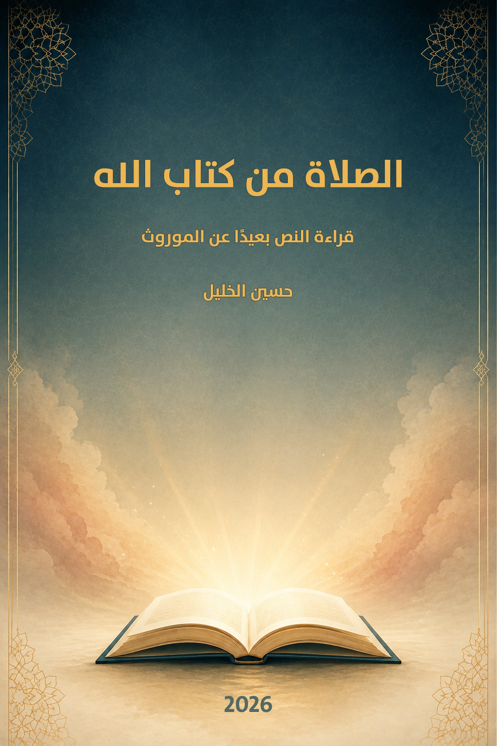
إصدار جديد: كتاب: الصلاة من كتاب الله. قراءة النص بعيدًا عن الموروث. يمكنكم زيارة صفحة الكتاب للاطلاع على التفاصيل .
logo
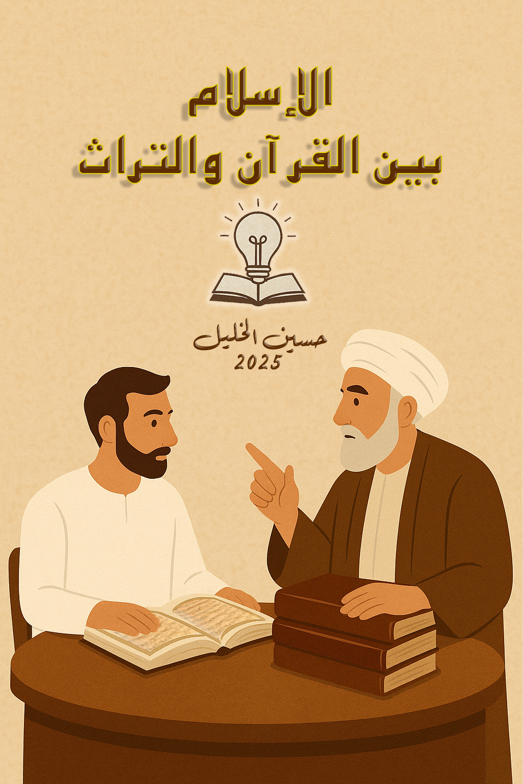
بإمكانكم الاطلاع على جميع الكتب من صفحة الكتب.
logo
لأي استفسار أو مراسلة، تفضلوا بزيارة صفحة "اتصل بنا".
logo
profile

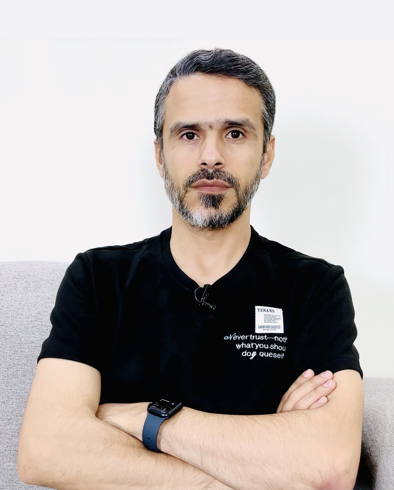
أهلاً بك في موقع حسين الخليل

قراءة عقلانية ونقد للتراث بمنهج معاصر. نافذة للتفكير والتأمل الحر.

كل ما أنشره لا أزعم فيه امتلاك الحقيقة المطلقة، ولا أُلزم به أحداً. غايتي أن أفتح نافذة للتفكير والتأمل.

هذا الموقع يعبّر عن رؤية صاحبه الفكرية فقط، ولا يتبع ولا يمثّل أي حزب أو جماعة أو طائفة أو جهة دينية أو سياسية.

نرحب بمشاركتك من خلال صفحة

قنواتنا على اليوتيوب

القناة الرئيسية
القناة الرئيسية
قناة تاريخ وأحداث
تاريخ وأحداث
قناة تدبر القرآن
تدبر القرآن

أحدث الحلقات

آخر التحديثات

استكشف المحتوى

B

الكتب

مؤلفات وروايات فكرية نقدية.

A

المقالات

طروحات فكرية معاصرة.

V

الروايات

نقد الروايات بميزان القرآن.

V

المعتقدات

أبرز الأديان والمعتقدات عبر التاريخ.

M

المنهج

قواعد تدبر القرآن الكريم.

K

خواطر

تأملات فكرية وإضاءات.

H

التاريخ

قراءة أحداث وشخصيات وحضارات ومدن التاريخ .

P

البودكاست

حلقات صوتية معمقة.

Q

ناقشني

مساحة للمناقشة وتبادل الأفكار والآراء.

D

حوارات

مناقشات مع مختلف الآراء.

I

تساؤلات

إجابات مختصرة ومباشرة.

S

دعم المحتوى

ساهم في نشر المعرفة.

كتب مختارة

@keyframes fadeInPage { from { opacity: 0; transform: translateY(15px); } to { opacity: 1; transform: translateY(0); } } body.no-scroll { overflow: hidden !important; height: 100vh; } a { text-decoration: none; color: inherit; transition: all 0.3s ease; } /* ==================== News Ticker (Original Structure) ==================== */ .news-ticker { background: var(--ticker-footer-bg); color: var(--intellectual-brown); height: var(--ticker-height); line-height: var(--ticker-height); position: fixed; top: 0; width: 100%; z-index: 1100; overflow: hidden; font-weight: 800; font-size: 1.05rem; display: flex; align-items: center; box-shadow: 0 2px 8px rgba(0,0,0,0.1); border-bottom: 2px solid var(--accent-gold); } .ticker-wrapper { display: flex; white-space: nowrap; animation: ticker-scroll 130s linear infinite; padding-right: 0; align-items: center; } .ticker-item { padding: 0 20px; display: flex; align-items: center; white-space: nowrap; } .ticker-logo-separator { height: 40px; width: auto; margin: 0 15px; display: block; } @keyframes ticker-scroll { 0% { transform: translateX(-10%); } 100% { transform: translateX(100%); } } /* ==================== Navigation (Exact Original Logic) ==================== */ .nav-overlay { position: fixed; top: 0; left: 0; right: 0; bottom: 0; background: rgba(0,0,0,0.6); backdrop-filter: blur(4px); z-index: 998; display: none; } nav { background: rgba(255, 255, 255, 0.98); backdrop-filter: blur(10px); padding: 0 5%; position: fixed; width: 100%; top: var(--ticker-height); z-index: 1000; display: flex; align-items: center; justify-content: space-between; box-shadow: 0 4px 20px rgba(0,0,0,0.1); height: 75px; } .logo-container { order: 1; } .logo-container img { height: 45px; width: auto; transition: 0.4s; } .nav-links { display: flex; flex: 1; justify-content: space-evenly; align-items: center; margin: 0 10px; order: 2; } .nav-links a { color: var(--intellectual-brown); font-weight: 700; font-size: 0.95rem; padding: 8px 12px; border-radius: 20px; white-space: nowrap; transition: 0.3s; } .nav-links a:hover { background: rgba(212, 175, 55, 0.1); color: var(--accent-gold); transform: translateY(-2px); } .hamburger { display: none; color: var(--intellectual-brown); font-size: 1.5rem; cursor: pointer; order: 3; } @media (max-width: 1200px) { .hamburger { display: block; order: 1; } .logo-container { order: 2; } .nav-links { position: fixed; top: calc(var(--ticker-height) + 20px); right: -280px; width: 280px; background: var(--surface-color); flex-direction: column; padding: 15px 0 40px; height: calc(100vh - (var(--ticker-height) + 75px)); box-shadow: -5px 0 15px rgba(0,0,0,0.1); transition: right 0.3s ease; overflow-y: auto; flex-wrap: nowrap; justify-content: flex-start; gap: 0; margin: 0; z-index: 1000; display: flex !important; } .nav-links.show { right: 0; } .nav-links a { color: var(--text-primary); width: 100%; padding: 18px 25px; border-radius: 0; font-size: 1.05rem; justify-content: flex-start; border-bottom: 1px solid rgba(0,0,0,0.03); font-weight: 700; } } /* ==================== Header & Featured Books (Original Structure) ==================== */ .unified-header { background: linear-gradient(135deg, #fdfcf8 0%, #f1e4c0 100%); padding: calc(var(--ticker-height) + 100px) 0 40px; border-radius: 0 0 50px 50px; margin-bottom: 30px; width: 100%; border-bottom: 2px solid var(--accent-gold); } .featured-books-container { padding: 20px 5px; max-width: 850px; width: 95%; margin: 0 auto 10px; text-align: center; position: relative; } .featured-books-title { color: var(--intellectual-brown); font-size: 1.8rem; font-weight: 800; margin-bottom: 30px; font-family: 'Tajawal', sans-serif; } .books-display-flex { display: flex; justify-content: center; align-items: center; gap: 25px; flex-wrap: wrap; } .book-item-link { display: block; perspective: 2000px; position: relative; z-index: 1; } .book-tilt-cover { width: 135px; height: 200px; object-fit: cover; border-radius: 15px; box-shadow: 15px 15px 35px rgba(0,0,0,0.1); display: block; transition: all 0.6s cubic-bezier(0.23, 1, 0.32, 1); transform: rotateY(-28deg) rotateX(8deg) rotateZ(-1deg); } .book-item-link:hover .book-tilt-cover { transform: rotateY(0deg) rotateX(0deg) rotateZ(0deg) scale(1.15); box-shadow: 0 25px 50px rgba(0,0,0,0.2); z-index: 10; } /* ==================== Intro Section (Moved to Light Background) ==================== */ .intro-bio-section { text-align: center; background: #fff; padding: 45px 30px; border-radius: var(--radius-xl); box-shadow: var(--shadow-sm); border: 1px solid rgba(212, 175, 55, 0.15); margin-bottom: 50px; } .profile-img { width: 140px; height: 140px; border-radius: 50%; border: 4px solid var(--accent-gold); object-fit: cover; object-position: center 15%; margin-bottom: 20px; transition: 0.4s; box-shadow: 0 5px 15px rgba(0,0,0,0.1); background: #fff; padding: 3px; } .intro-bio-section h1 { font-size: 2.1rem; font-weight: 800; margin-bottom: 12px; font-family: 'Tajawal', sans-serif; color: var(--intellectual-brown); } .intro-bio-section p.subtitle { font-size: 1.2rem; color: var(--intellectual-brown); font-weight: 500; max-width: 700px; margin: 0 auto 25px; } .disclaimer-text { margin: 0 auto; max-width: 800px; font-size: 1.05rem; color: var(--text-secondary); line-height: 1.8; font-weight: 500; text-align: right; background: #faf8f2; padding: 25px; border-radius: 15px; border-right: 4px solid var(--accent-gold); } .feedback-inline-link { color: var(--accent-gold); font-weight: 800; text-decoration: none; } .feedback-inline-link:hover { color: var(--intellectual-brown); } /* ==================== Search Results Layer Fix ==================== */ .unified-header { position: relative; z-index: 500; } .unified-header .universal-search { position: relative; z-index: 1000; } .universal-search { width: 100%; max-width: 600px; margin: 25px auto 0; position: relative; } #globalSearch { width: 100%; padding: 18px 25px; border-radius: 50px; border: 1px solid #e2e8f0; font-size: 1rem; box-shadow: 0 10px 30px rgba(0,0,0,0.05); outline: none; text-align: right; font-family: 'Tajawal', sans-serif; background: #fff; } /* ==================== Container & Grid (Exact Original Dimensions) ==================== */ .container { max-width: 1200px; margin: 0 auto; padding: 0 20px; width: 100%; } .section-title { margin: 60px 0 35px; text-align: center; } .section-title h2 { font-size: 1.8rem; font-weight: 800; color: var(--intellectual-brown); position: relative; display: inline-block; } .section-title h2::after { content: ""; position: absolute; bottom: -10px; left: 20%; width: 60%; height: 4px; background: var(--accent-gold); border-radius: 2px; } .quick-actions { display: flex; justify-content: center; gap: 15px; margin-top: 10px; margin-bottom: 50px; position: relative; z-index: 100; flex-wrap: wrap; } .youtube-btn { background: #fff; color: #ff0000; padding: 12px 25px; border-radius: 50px; font-weight: 700; box-shadow: var(--shadow-md); border: 2px solid var(--accent-gold); display: flex; align-items: center; gap: 8px; transition: 0.3s; } .youtube-btn:hover { transform: translateY(-5px); background: var(--accent-gold); color: white; } .updates-section { margin-bottom: 60px; text-align: right; } .update-item { display: flex; align-items: center; padding: 12px 15px; border-bottom: 1px solid rgba(0,0,0,0.05); transition: 0.3s; border-radius: 8px; margin-bottom: 5px; background: #fff;} .update-badge { background: var(--accent-gold); color: white; font-size: 0.7rem; padding: 3px 10px; border-radius: 12px; margin-left: 12px; font-weight: 800; animation: blinking-new 1.4s infinite; } @keyframes blinking-new { 0%, 100% { opacity: 1; transform: scale(1); } 50% { opacity: 0.5; transform: scale(0.95); } } .cards-grid { display: grid; grid-template-columns: repeat(auto-fill, minmax(270px, 1fr)); gap: 25px; margin-bottom: 80px; } .feature-card { background: #fff; border-radius: var(--radius-xl); padding: 30px; text-align: center; box-shadow: var(--shadow-sm); border: 1px solid rgba(0,0,0,0.05); cursor: pointer; transition: 0.3s; display: flex; flex-direction: column; align-items: center; } .card-icon-wrapper { width: 70px; height: 70px; background: rgba(212, 175, 55, 0.05); border-radius: 50%; display: flex; align-items: center; justify-content: center; margin-bottom: 20px; } .card-icon-wrapper img { width: 35px; } .feature-card:hover { transform: translateY(-10px); box-shadow: var(--shadow-lg); border-color: var(--accent-gold); } /* ==================== Slider (Original Style) ==================== */ .slider-section { margin: 0 auto 60px; position: relative; border-radius: var(--radius-xl); overflow: hidden; box-shadow: var(--shadow-lg); aspect-ratio: 16/9; width: 100%; max-width: 850px; background: #000; } .slider { display: flex; height: 100%; transition: transform 0.4s ease-in-out; } .slide { min-width: 100%; position: relative; } .slide img { width: 100%; height: 100%; object-fit: contain; } .slide-content { position: absolute; bottom: 0; left: 0; right: 0; background: linear-gradient(to top, rgba(0,0,0,0.85), transparent); padding: 40px 20px 20px; color: white; text-align: right; } .slider-arrow { position: absolute; top: 50%; transform: translateY(-50%); background: rgba(0,0,0,0.4); color: white; border: none; width: 45px; height: 45px; border-radius: 50%; cursor: pointer; z-index: 100; display: flex; align-items: center; justify-content: center; } .slider-nav { position: absolute; bottom: 20px; left: 50%; transform: translateX(-50%); display: flex; gap: 10px; z-index: 100; } .slider-dot { width: 10px; height: 10px; border-radius: 50%; background: rgba(255,255,255,0.5); cursor: pointer; } .slider-dot.active { background: white; transform: scale(1.3); } .book-tabs { display: grid; grid-template-columns: repeat(3, 1fr); gap: 20px; margin-bottom: 60px; } .book-card { background: #fff; border-radius: var(--radius-lg); overflow: hidden; box-shadow: var(--shadow-sm); border: 1px solid rgba(0,0,0,0.05); transition: 0.3s; } .book-card img { width: 100%; height: 220px; object-fit: contain; background: #f8fafc; padding: 10px; } .book-info { padding: 15px; text-align: center; } .book-card:hover { transform: translateY(-10px); } .social-section { text-align: center; margin-bottom: 60px; background: #fff; padding: 40px; border-radius: var(--radius-xl); box-shadow: var(--shadow-sm); border: 1px solid rgba(212,175,55,0.1); } .social-grid { display: flex; justify-content: center; gap: 15px; flex-wrap: wrap; margin-top: 30px; } .social-btn { width: 55px; height: 55px; border-radius: 50%; background: var(--ticker-footer-bg); display: flex; align-items: center; justify-content: center; color: var(--intellectual-brown); transition: 0.3s; font-size: 1.5rem; box-shadow: 0 4px 10px rgba(0,0,0,0.05); } .social-btn:hover { background: var(--accent-gold); color: white; transform: translateY(-8px) scale(1.1); } /* ==================== Footer (Exact Original) ==================== */ footer { background: var(--ticker-footer-bg); color: var(--intellectual-brown); padding: 60px 20px; text-align: center; border-top: 3px solid var(--accent-gold); } .footer-links { display: flex; justify-content: center; gap: 12px; margin-bottom: 25px; flex-wrap: wrap; } .footer-links a { color: var(--intellectual-brown); font-weight: 700; text-decoration: none; opacity: 0.8; } .footer-links a:hover { color: var(--accent-gold); opacity: 1; } .copyright { color: var(--intellectual-brown); font-size: 0.85rem; border-top: 1px solid rgba(0,0,0,0.05); padding-top: 25px; margin-top: 25px; opacity: 0.7; font-weight: 500; } @media (max-width: 768px) { .unified-header { padding: calc(var(--ticker-height) + 80px) 0 30px; border-radius: 0 0 35px 35px; } .books-display-flex { flex-wrap: nowrap; gap: 5px; } .book-item-link { flex: 1; max-width: 23%; } .book-tilt-cover { width: 100%; height: auto; aspect-ratio: 2/3; border-radius: 8px; } .book-tabs { grid-template-columns: 1fr; } .cards-grid { grid-template-columns: repeat(auto-fill, minmax(140px, 1fr)); gap: 15px; } .feature-card { padding: 20px 10px; } .card-icon-wrapper { width: 55px; height: 55px; } .card-icon-wrapper img { width: 28px; } .feature-card h3 { font-size: 0.95rem; } }
صفحة «ملاحظاتكم» لاستقبال اقتراحاتكم لتطوير الموقع، والإبلاغ عن الأعطال والمشاكل، وتقديم الشكاوى.
logo
إصدار جديد: كتاب: الصلاة من كتاب الله. قراءة النص بعيدًا عن الموروث. يمكنكم زيارة صفحة الكتاب للاطلاع على التفاصيل .
logo
بإمكانكم الاطلاع على جميع الكتب من صفحة الكتب.
logo
لأي استفسار أو مراسلة، تفضلوا بزيارة صفحة "اتصل بنا".
logo
profile

أهلاً بك في موقع حسين الخليل

قراءة عقلانية ونقد للتراث بمنهج معاصر. نافذة للتفكير والتأمل الحر.

كل ما أنشره لا أزعم فيه امتلاك الحقيقة المطلقة، ولا أُلزم به أحداً. غايتي أن أفتح نافذة للتفكير والتأمل.

هذا الموقع يعبّر عن رؤية صاحبه الفكرية فقط، ولا يتبع ولا يمثّل أي حزب أو جماعة أو طائفة أو جهة دينية أو سياسية.

نرحب بمشاركتك من خلال صفحة

القناة الرئيسية قناة: تاريخ وأحداث قناة: تدبر القرآن

أحدث الحلقات

آخر التحديثات

استكشف المحتوى

B

الكتب

مؤلفات وروايات فكرية نقدية.

A

المقالات

طروحات فكرية معاصرة.

V

الروايات

نقد الروايات بميزان القرآن.

V

المعتقدات

أبرز الأديان والمعتقدات عبر التاريخ.

M

المنهج

قواعد تدبر القرآن الكريم.

K

خواطر

تأملات فكرية وإضاءات.

H

التاريخ

قراءة أحداث وشخصيات وحضارات ومدن التاريخ .

P

البودكاست

حلقات صوتية معمقة.

Q

ناقشني

مساحة للمناقشة وتبادل الأفكار والآراء.

D

حوارات

مناقشات مع مختلف الآراء.

I

تساؤلات

إجابات مختصرة ومباشرة.

S

دعم المحتوى

ساهم في نشر المعرفة.

كتب مختارة